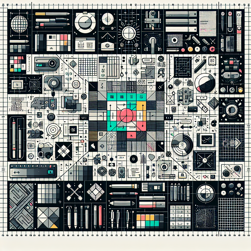
The Power of Grids in Layout Design
Designing a layout can be likened to making a sandwich. You need to consider what goes in between, how to stack them, and how to make it appealing to the eyes and taste. Just as bread slices give structure to the sandwich, grids provide a structure to a design layout. At its core, Grids in layout design serve as an invisible foundation to your design. They guide how elements are arranged in your design, ensuring consistency, clarity, and aesthetically pleasing design.
What are Grids in Layout Design?
Grids in design is a technique that involves dividing a page into a series of rows and columns. Imagine you’re drawing a series of vertical and horizontal lines on your layout. These lines serve as markers to arrange and size design elements, ensuring a clear, cohesive, and balanced design.
The Power of Grids
Grids make your design appear more professional and visually appealing. They help to maintain alignment and consistency in design, especially in multi-page designs such as magazines, newspapers, and websites. They are also essential in responsive design, where the layout must adjust to different screen sizes.
Additionally, grids provide a framework that can simplify the design process. With a grid system, designers can easily determine where elements should be placed. Grids save time by reducing the number of layout decisions a designer has to make.
How to Use Grids in Design
Using grids in design begins by determining the margins, the space between content, and the edge of the page. Then define the number of columns that will be in the grid. More columns provide more flexibility but also increase complexity. After this, decide on the space between the columns, known as gutters.
When you start placing elements on the grid, follow a consistent alignment. Keep related elements together. This includes keeping captions under images or labels with their corresponding form fields. Remember that white space is essential in design. It gives room for elements to breathe and helps to direct the viewer’s attention.
Types of Grids
There are several types of grids that you can use in your design. These include the manuscript grid, which is the simplest form of a grid. It involves a single large rectangular area that takes up most of the space on a page.
The column grid divides the page into vertical columns. It’s ideal for designs with lots of text or images. A modular grid is a more complex grid system that divides the page into both rows and columns. It’s perfect for designs with a lot of information that needs to be perfectly organized. And then there’s the hierarchical grid, which isn’t based on consistent rows and columns but instead is organized based on the importance and hierarchy of different elements.
Conclusion
Grids have revolutionized the design industry due to their ability to create more organized, balanced, and professional designs. They serve as a guide to designers, allowing them to create pleasing, easy-to-understand designs that have visual harmony. Understanding how grids work in layout design can significantly improve your design skills and help you to create better, more professional designs.
Frequently Asked Questions
-
What are the advantages of using grids in design?
Grids provide a structured, balanced framework for designs, ensuring consistency, alignment, and visual harmony. They also make the design process more effortless by making layout decisions easier and quicker.
-
Do all designs need to use a grid?
No, not all designs need to use a grid. Grids are particularly useful in complex or multi-page designs where alignment and consistency are key. However, for simpler or more artistic designs, a grid is not always necessary.
-
How do I choose the right type of grid for my design?
The type of grid you choose for your design will depend on the type of content you are creating. Consider the complexity, the amount of text or images, and the purpose of the design.
-
Can I use multiple types of grids in one design?
Yes, you can combine different types of grids for one design to meet the needs of your specific design project.
-
How do grids impact the user’s experience?
Grids contribute to a better user experience by helping to create a clear, easy-to-navigate layout. They can help guide the viewer’s eye and make information more accessible and digestible.

